Nike is regarded as one of the most well known brands in the world. The iconic Swoosh is a simple yet effective logo and their advertisements are regarded world class. I personally enjoy the brand and have worked for Nike in the past, so it makes sense to design advertisements for the brand. I must stress that these advertisements are strictly proposed and is used for academic purposes only. I do not work for Nike's design department and all rights are reserved to their brand.
Objective: Nike Inc. is looking to start a new advertising campaign to advertise their membership program. Nike+ is Nike’s exclusive membership program that offers rewards and milestone achievements. Nike also offers member only products and access to special sales coupons through the app or email. Design an two advertisement to illustrate the benefits of being a member. These advertisements will be featured as magazine spreads inside various monthly publications (i.e: Complex, Sports Illustrated, etc.)
Target Audience: The target audience should consist of young to middle aged adults who enjoy Nike as a brand. They must also enjoy shopping as most Nike stores that offer coupons are physical retail stores.
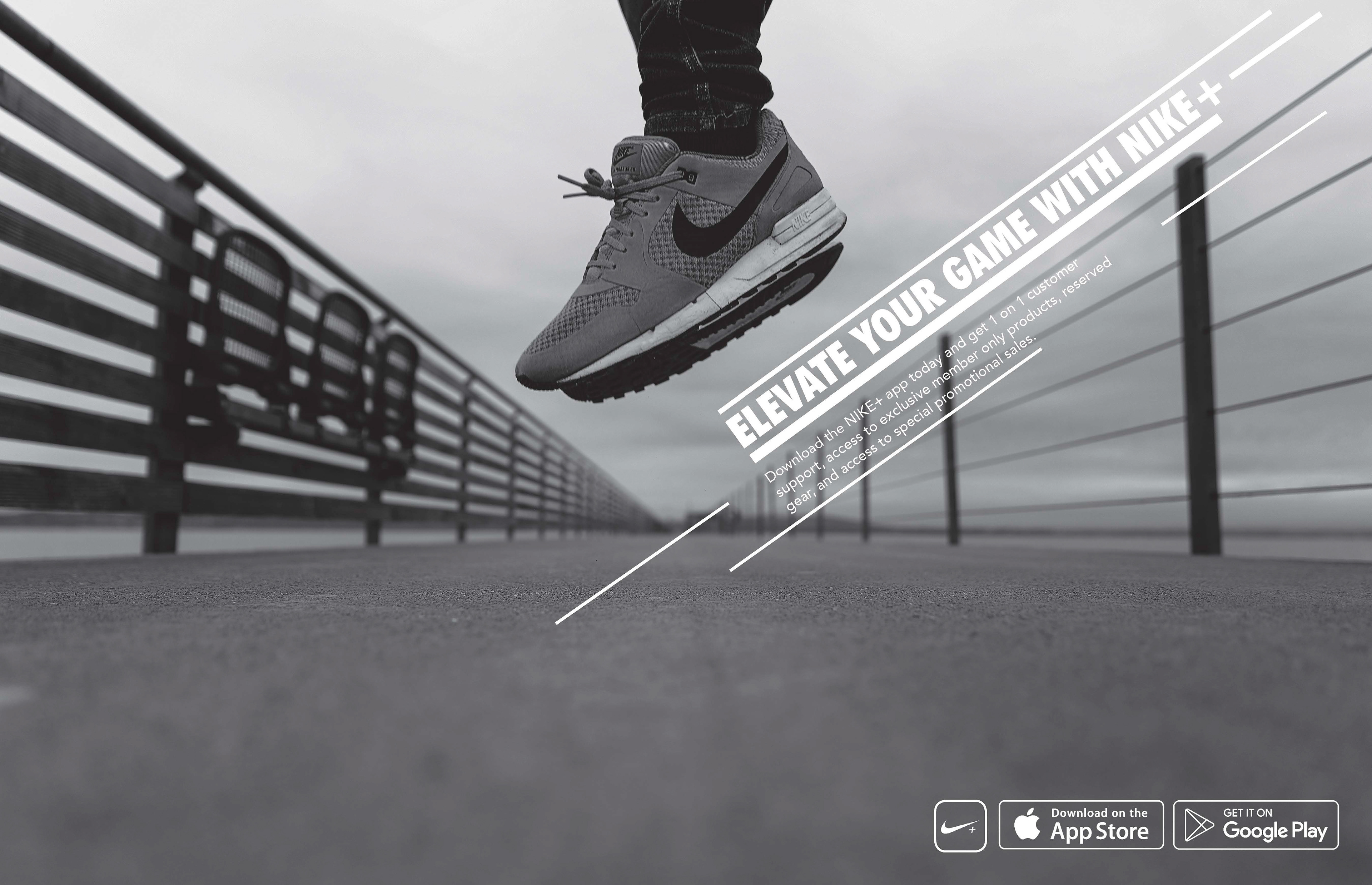
Style Concept: The stylistic choices of these advertisements should be in black and white and should include the iconic Nike swoosh in the images. Use linear lines in interesting ways throughout the advertisements. Futura BT Condensed ExtraBlack is used for page headers as it’s Nike’s staple typeface for advertisements.
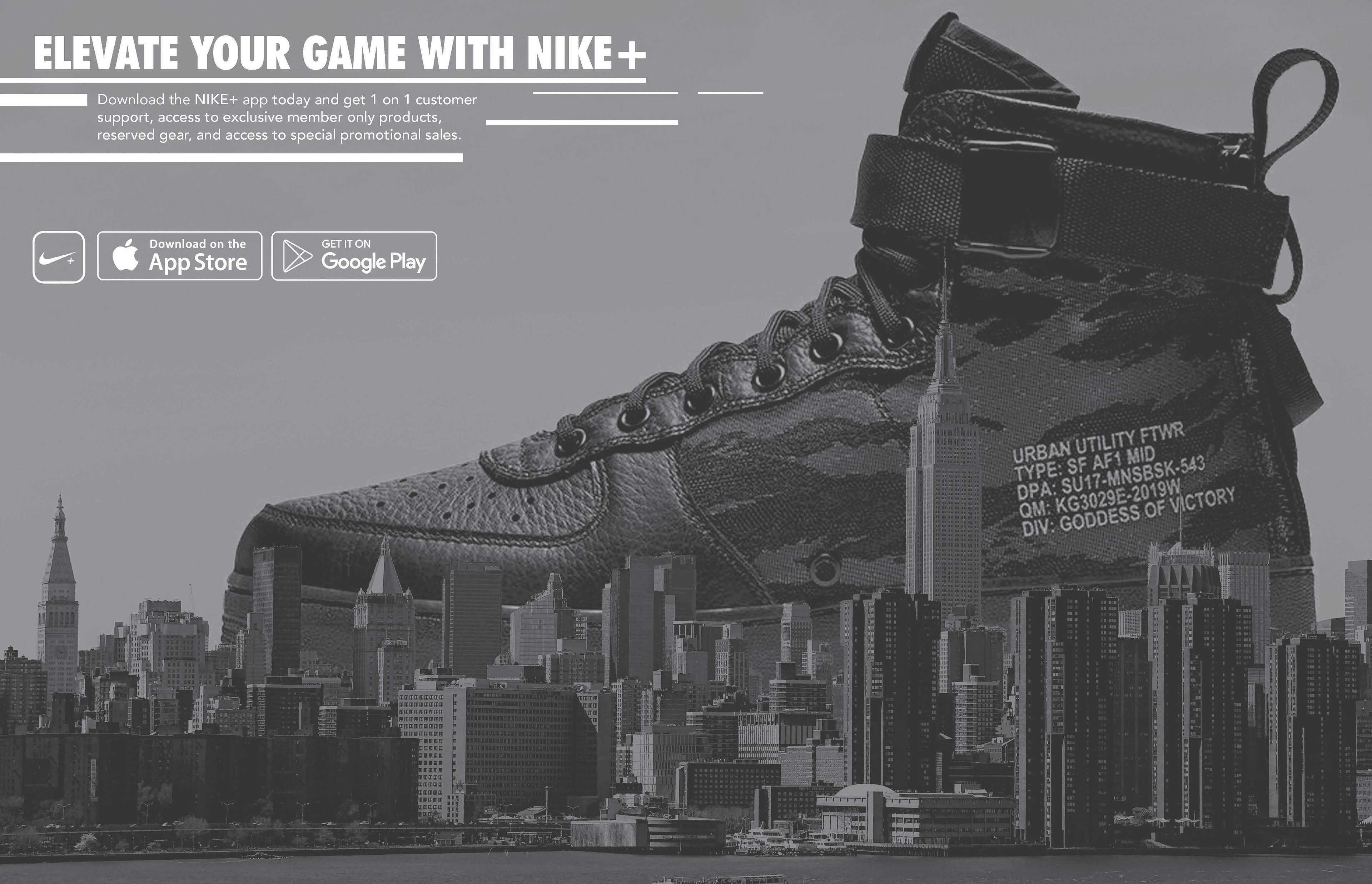
I initially wanted to start this project out advertising a specialized Air Force 1 shoe that was available on Nike's SNKRS app but knowing how Nike is consistently pushing their membership program, I decided to work on NIKE+ advertisements instead.
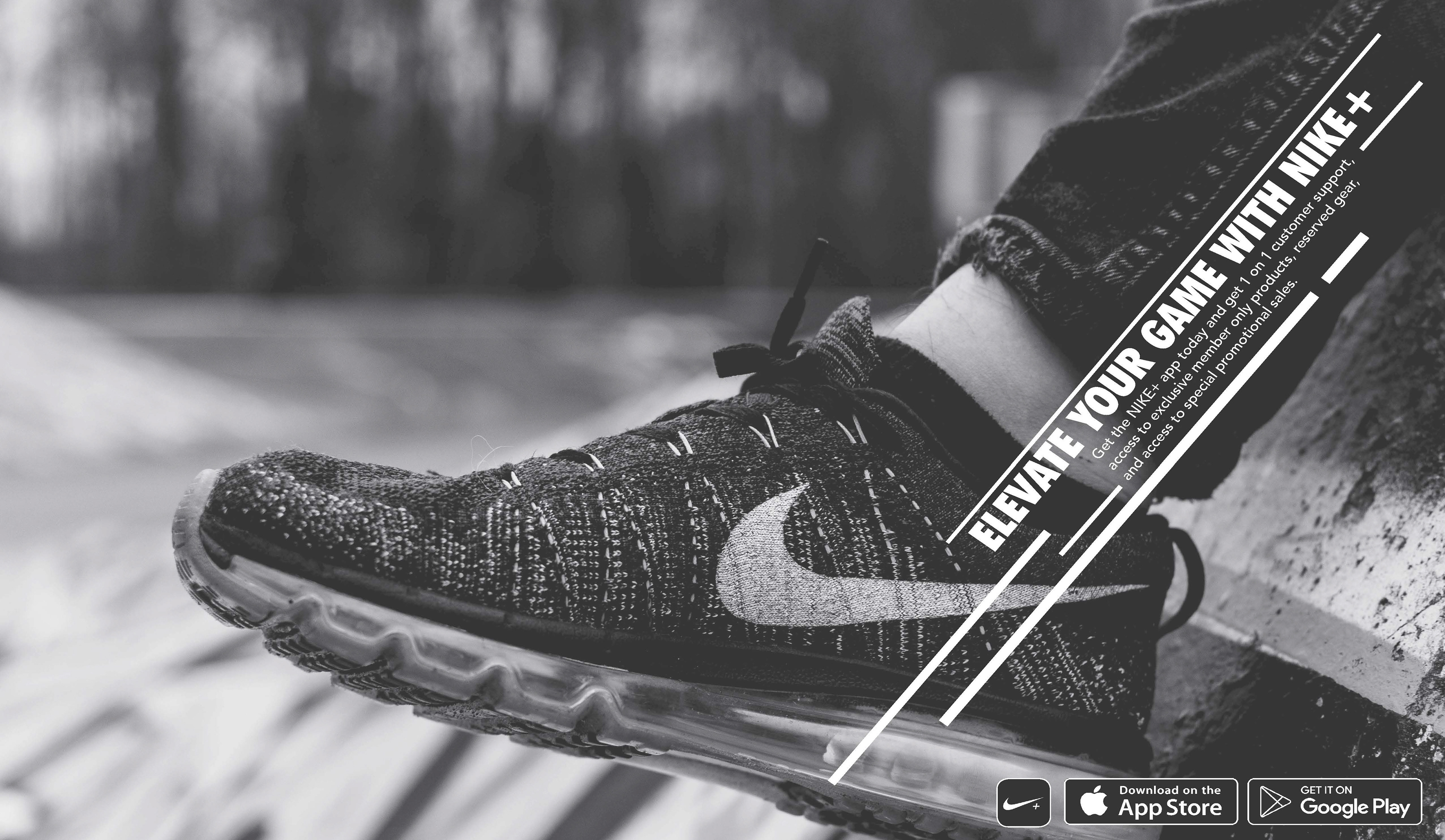
The linear lines style was inspired by their newest venture in Air Max styles for most of their apparel lines. The image here was an additional tie in to that style choice.

The "Elevate Your Game" slogan fit nicely along side the linear lines. The lines were also influenced by the "+" on Nike+ to give it a sense of unity.

Click the PDF icon to view full the Creative Brief.